Barr Publicity & Editorial Services
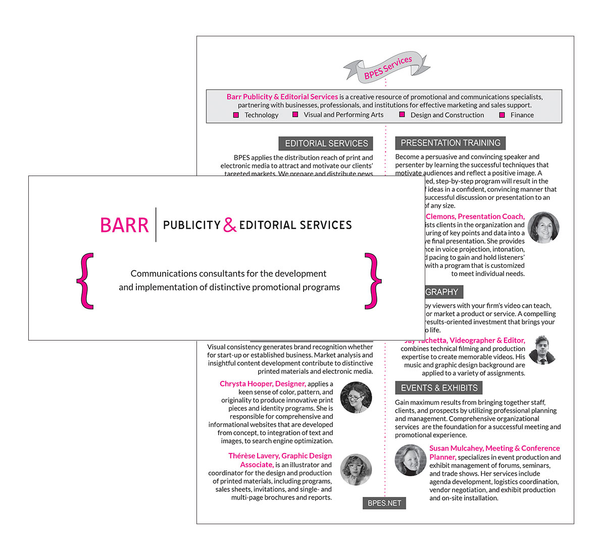
FROM THE CLIENT We need a new website and brochure that are easy to navigate and clearly show our services. It needs to tie into our branding and not look trendy – we don’t want to be redesigning our website in a year because the trends have changed.
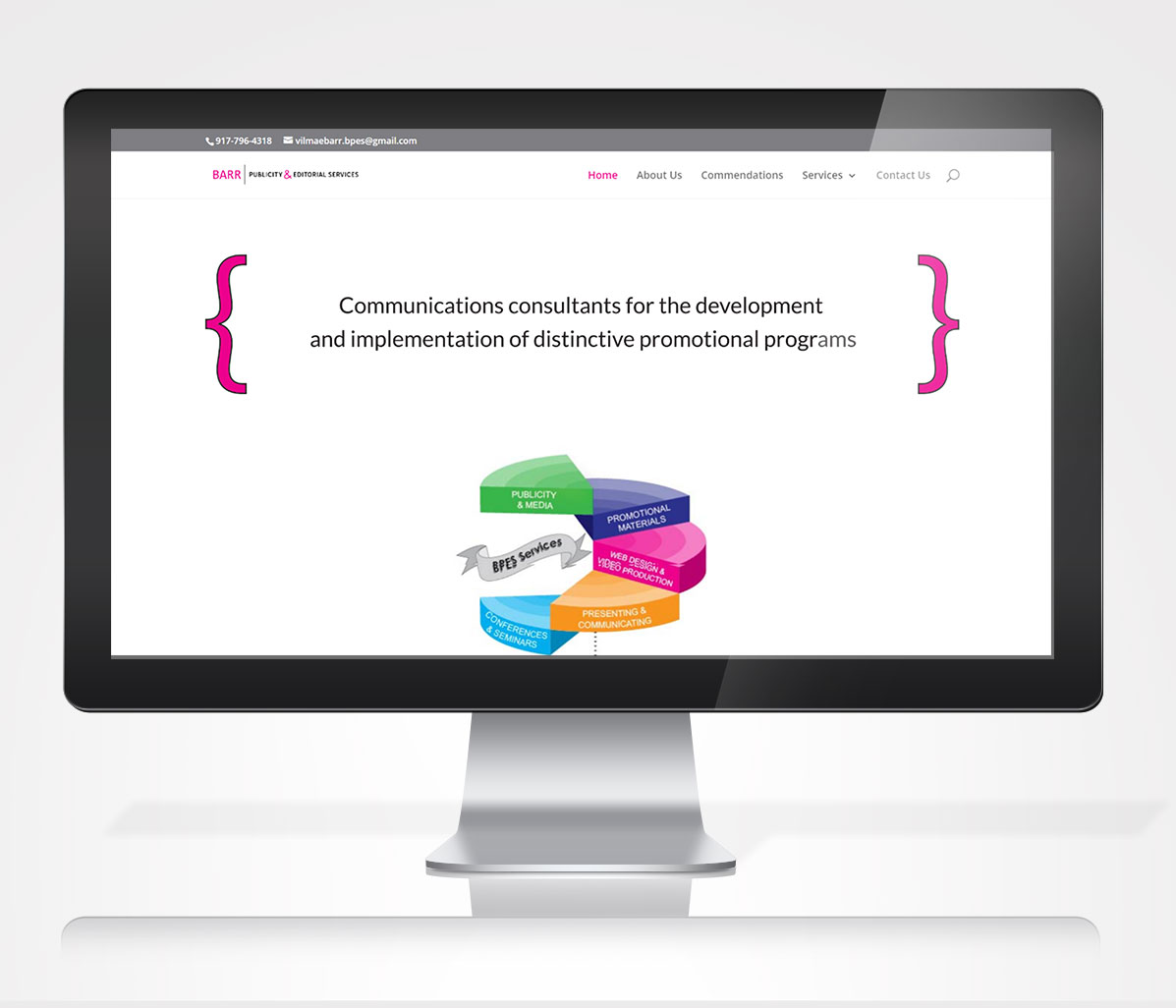
DESIGN We started with the website design because the client prioritized the website over the brochure design. My first step was to look at the content on the site they had at the time and evaluate everything on the site. We went over my notes on what we could keep and things that needed to be updated or thrown out. I also created a list of what they didn’t have on the website that needed to be on the new one. The lists gave us a clear picture of what the client needed to provide and what was going to be on the new website. My next step was to create a mock up of the website so they could see my vision and provide feedback.
My next step was to create a mock up of the website so they could see my vision and provide feedback. Once it was approved, I started the process of coding the new website and adding content. We met frequently during the process so they could see the progress of the site and give input.
Ater launching the website, it was easy to create a brochure design for them. We used modified versions of text from the website and kept the design clean and simple.
PROJECT
– Website Redesign
– Brochure Design
Chrysta Hooper has served as a graphic design consultant to my firm for the past two years. She is very talented artistically and contributes excellent suggestions to improve the concept of the final products. Chrysta is a very smart young lady and expresses herself well. She has extraordinary knowledge of the electronic communications environment and is creative in their use of these programs as applied to her assignments. I look forward our continued business relationship.


