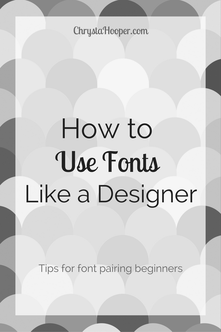
How to Use Fonts Like a Designer
There are three basic categories when describing fonts: Serif, Sans-serif, and Cursive. Even if you aren’t a designer, you’ve probably heard these terms. If you aren’t familiar with these terms, let’s break them down.
When you think about classic fonts like Georgia or Times New Roman, you notice the tips on the ends of the letters? These are called “serifs.” Serifs come in all different shapes and sizes, from slabs (thick and chunky) to hair (tiny wisps).

If we look up “sans” in the dictionary, we find that the term is in root and means “without.” So sans-serif means simply means “without serifs.” You can see this demonstrated in the font Arial, where there are no serifs on the ends of the font.

Cursive fonts are fairly obvious. You can easily identify this category when you see type that is created from handwriting and has strokes that are varied and fluid.
How many fonts are too many?
It can be easy to be overzealous when using fonts. I recommend you use no more than 3 fonts for any project. Using too many can make your product look like a mess, and no one wants that!
What are the best ways to pair fonts?
Now that we have a basic understanding of the different categories, there are two simple ways to pick fonts that will compliment each other and give your product a professional, polished look.
- Pair different font families
- Use weighted fonts to create visual contrast between two fonts in the same family
ONE: Pair different font families
Pick a font from any of the three categories we discussed. To pair your chosen font, pick another font from any other category EXCEPT the one you just chose. Here are a few tips for pairing different font families:
- The main thing to consider when pairing fonts is contrast. Putting a thick font for headlines with a thinner font for the body text will create a pleasing contrast.
- Try increasing the spacing for the title text (not recommended for body text) to give the fonts room to breathe.
- If you want to have a more casual feel for your project, try pairing a rounded font with a narrow font.
TWO: Use weighted fonts to create contrast between two fonts in the same family
Choose a serif or sans-serif font for your project. Make sure the font that you’ve chosen has at least two fonts in the same font weights or varieties. For instance, the font family Arial has bold, regular, and italic weights for you to choose from. You can use any combo that has contrast. From bold heavy-weight paired with a light or regular weight or use a regular weight with an italic weight.
I would recommend staying away from pairing cursive fonts together in different weights. Cursive should only be used for titles – not body text. When it is in a small font size, and there is a lot of text, it is often difficult to read.
Do you have font pairing tips I didn’t cover? Was this article helpful? I’d love to know your thoughts in the comments below!
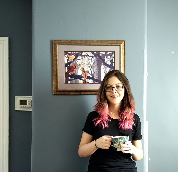 I’m Chrysta, an artist, illustrator & designer living in a small town in Pennsylvania. I love creating things that will bring joy and happiness to others.